Insight
The most common cause of spinal cord injuries in the US are auto accidents, which account for almost half of new injuries every year. The number one cause of those accidents are drivers aged 16-18.

Idea
Create an app to helps parents play a more active role in their teen driver’s education, practice, and safety.
TIMELINE Initial release in 2017 / Additional features and more in-depth user testing in 2018
TEAM A Creative Director, Myself as an ACD/designer, a UX Analyst and a Visual Designer.
Shepherd Center is a not-for-profit hospital in Atlanta that specializes in neck and spine injuries. Partnering with the State of Georgia, they approached us in order to proactively address the teen drivers that are causing a disproportionate number of the injuries that they treat.
First, we identified our primary user as not the driver, but the teacher in the car with them: usually a parent or guardian.
Then we created a detailed user journey to help us understand the screens we’d need, where decisions were made and where pain points might be. This also allowed us to determine what features and content needed to be on each individual screen.
We did a lot of whiteboarding for this project. I led group brainstorming sessions for product strategy, requirements gathering, and early prototype sketches.
Next, we moved into medium-fidelity wireframing, where we explored layout, content placement & hierarchy, and user flow.

The result was a really great looking app, having established an automotive dashboard paradigm for the product’s primary interface.
Useful features included:
A driving log that can be used to track learning progress and driving hours. It recorded whether a drive occurred at night or during the day, as states have specifics practice hour requirements.
The ability to rate your student’s drives and record the weather.
Education components included 10-chapter curriculum and a driver’s license quiz.
While we started with the rules and guidelines of Georgia, the app was designed to meet driver education requirements in all 50 states.

In addition to establishing the overall look & feel, I led the effort to concept, name, and brand the app.
I moderated several name-storming sessions, where we ultimately voted on our favorites, and then worked with the legal department at the hospital to determine what we could use.
As part of a second phase executed a year later, we introduced new features such as personalized content, searchable lessons, Adjustable text size, and practice reminders.
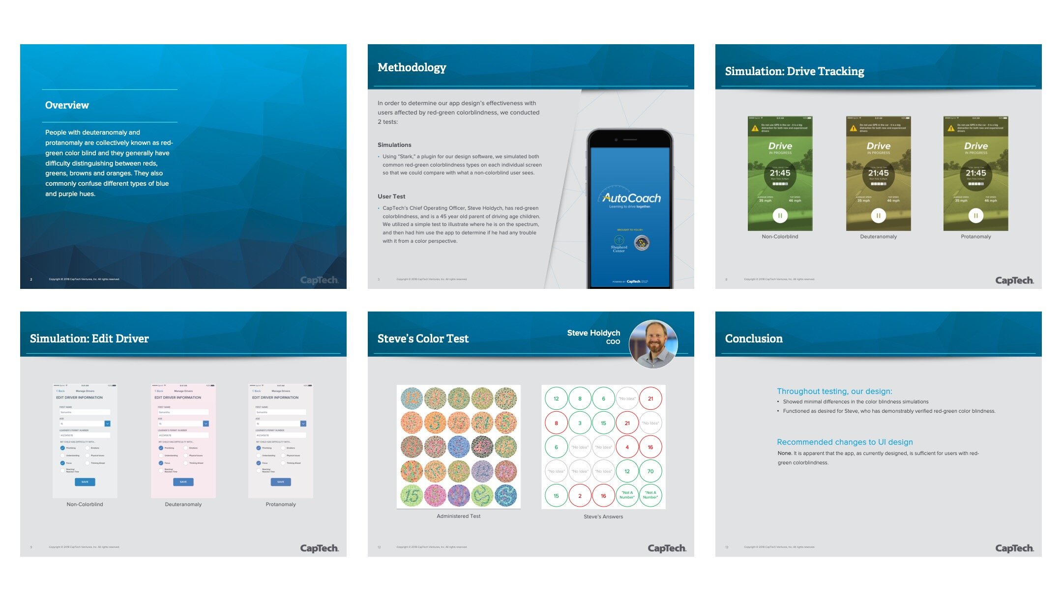
We also put a lot of effort into testing and optimizing for accessibility. One group the hospital wanted to ensure support for was vision-impaired teens. The 2nd phase of the project did not have budget for a UX Analyst, so I researched, scripted, designed and executed this Red-Green Color Blindness Assessment on our COO.
In a rare occurence, no changes were recommended, as the test validated that the app was working sufficiently even for those users.

What we learned
Creating a tool that inclusively solves a real problem is very satisfying.
As a leader, you have to support people in a way that resonates with them as an individual.
Technology can fundamentally change how we do anything, including how we learn how to drive.
